
Product packaging has a profound impact on consumer behavior and buying decisions. It’s one of the best marketing tools, as the look and feel of the packaging can be a deciding factor in whether someone shops or skips.
Custom labels are a big part of product preparation, as they serve a dual purpose of enhancing aesthetic appeal while providing valuable info. If you want to customize your labels and product packaging, then it’s worth thinking about different colors and how their meaning can have an impact on your marketing. Keep reading to learn more about color psychology to help you choose custom label colors.
Aim for Complementary Colors
One of the biggest tips for custom product label printing is to choose complementary colors as much as possible. Also known as opposite colors, these create a strong, eye-catching contrast for maximum visual appeal, which, of course, is beneficial in advertising and marketing.
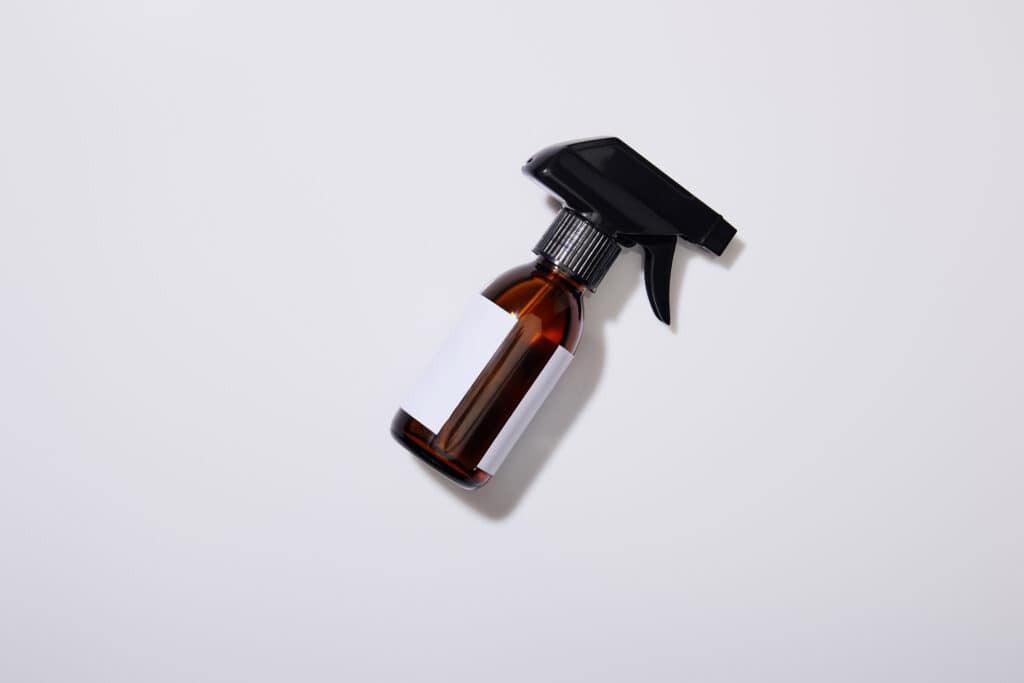
Color combination and legibility are important, so customers can see what they are buying. Dark text on a light background tends to be most visually appealing, as the company name stands out and the eyes don’t have to strain to see it. Black on white is another classic choice if you prefer less color. When in doubt, try an online color wheel and look for opposite colors.
Create a Positive Association
Many colors offer a positive association by encouraging happy emotions in consumers. Custom labels with attractive colors will grab attention and make shoppers feel more confident in their buying decisions.
Here are some of the top picks for positive colors from industry experts:
- White: it’s clean, relaxed, and tends to make you feel secure.
- Black: another option for security and stability, black exudes wisdom and sophisticated class.
- Green: a symbol of nature, green inspires relaxation and happiness while possibly lowering blood pressure.
- Blue: it’s a symbol of happiness and creativity, with beautiful shades of blue used to build trust.
- Orange: a representation of adventure and vitality. Orange displays self-confidence, too.
There are also a few colors to think twice about before incorporating them into your product labels. This includes:
- Pink: it’s tranquil and feminine, so it works better for some products than others. Consider your audience and who you most want to buy your product.
- Bright yellow: neon yellow can be harsh on the eyes, and has been linked to feelings of danger and irritability. That’s why you don’t want to overuse it.
- Red: this is another color to use in moderation, as it also exudes danger and sometimes failure. When combined with softer complementary colors, red can signal power and strength.
- Brown: it’s usually a passive color that may feel depressing to shoppers.
Final Thoughts: Custom Label Colors
As you can see, there’s a whole rainbow to explore when crafting custom labels for your business. Just remember to thoughtfully consider the emotions and psychology of each color before using it, as this way, you can achieve better results as your product packaging has a real impact.